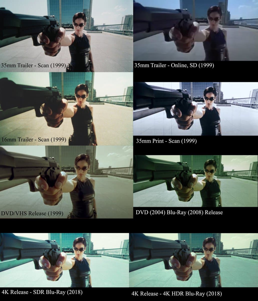
The Matrix color grading
Today is one of those days where time anxiously melted away as I struggled to get anything that I planned to get done before April ends. I have it all in my head, but I just lack the energy and will to even move. Headaches are the worst.
It feels time is ticking as May now come crashing on me, and the day I fly back to the US creeps up to me closer and closer. I still have so much to accomplish.
But then I remember time is relative, and we're all going to die one day, so I'm glad I just did what I enjoyed doing. I rewatched The Matrix and watch a few videos on color grading today. I have approx. 531 video shots from my HK SZ trip, and I plan to edit them into a film-like cinematic vlog.
After falling into the rabbit hole of color grading, all I've learned so far is how complicated it is, and how they have their own language that you have to learn. It's both exciting and overwhelming. For now, the biggest questions in my head are whether I have to color grade each individual scene, how I will blend all of them together nicely, whether shooting in iPhone 13 mini with HDR still requires color space transform, and how to make my vlog film-like without paying.
I took some notes for their terminologies from this video: Color Grading 101 - Everything You Need to Know
- color correction
- the step before color grading where you tweak the white balance, exposure, highlights, mid tones, and noise reduction, etc.
- color grading
- add character and atmosphere to scenes by adding curves, masks, color wheels, grain, glow, chromatic aberrations
- color spaces
- most common profile REC. 709 (est. 1990)
- this ensures all devices display the same image (of the same color)
- Rec. 2020 is the new richer color space with HDR, which allows for more brightness, very vivid colors and deep blacks
- there are acquisition color spaces which are specific color spaces optimized for camera manufacturers with specific sensors
- RAW
- saves as much information received by the sensor as possible.
- it's much larger in storage, but you can a ton of useful data.
- it's recorded in 12/14 bits, which are number of colors can be obtained. 12 bits = 4096 (R) x 4096 (G) x 4096 (b) = 68 billion colors.
- LOG
- alternative to RAW which uses an optimized gamma curve to record as much information in an image as possible in highlights and shadows
- uses a log curve rather than linear to record highlights and shadows
- LUT: Look-up Table
- technical LUTs are used in video production to see something close to the final result while shooting in raw, most monitors/cameras have this
- creative LUTs are color filters that you can apply to switch from one style to another, you can download packs from specific movies to copy their look.
- nodes
- like layers in photoshop, it's a great visual workflow to add adjustments and effects in an organized and non-destructive way, making it easy to rework upstream and downstream of each step
- an oscilloscope that displays brightness levels of different areas of an image in real time.
- for evaluating exposure and balancing an image's luminance
- Scopes
- tools that ensure our edits are not degrading the image and is balanced overall.
- the three main ones are waveforms, RGB parade and vectorscope
- Waveforms
- a graph that shows highlights and low lights
- it's a vertical graph that goes from 0 - 100, if your waveform is crashing against the top and bottom, it's over/under exposed, respectively
- RGB parade
- a waveform monitor broken into three graphs: RGB channels
- useful for controlling exposure and white balance, i.e. if the image has a blue cast, you can see the blue graphic shift up compared to the other two, so you can bring it down to make it balanced
- Vectorscope
- like a compass for colors, showing you where colors in your video lie and how intense they are
- plots color intensity and hue of an image on a circular graph
- used primarily for adjusting skin tones and color balance
- it should be around the center for color, the more away it is from the center, the more saturation
- for skin tone, it should fall along the 11 o'clock position, a diagonal line between the red and yellow lines.
Inspirations
- CHINA TOWN (FX30)
- New York City Film Emulation
- Japan – Gawx
- Three Days in Vienna | Fuji xH2s | Sigma 18-35mm 1.8 | Graded with Dehancer
- Solo in Porto | Cinematic Video 4K | #Fujifilm XT30
More tutorials
Color grading from 0
- How to Color Grade From 0 with Davinci Resolve (for Beginners) ✧ Asian, Japanese, Chinese Film Style
- From Start to Finish: Mastering Color Grading in DaVinci Resolve for a Full Scene
Film effect for free
- Emulating 16mm or 35mm Film // Color Grading Tutorial
- Davinci Resolve Film Look + Free PowerGrade
- How to Get a RETRO FILM LOOK in DaVinci Resolve 18 Color Grading Tutorial
node trees
LUTs
iPhone
efficiency